5 reasons you should develop mobile-first
And a bonus point that changes everything
Table of contents
- 1. According to the google analytics benchmarking feature, 68.1% of your website visits come from mobile devices:
- 2. It is always easier to scale up than scale down:
- 3. Mobile-first design approach emphasizes focus on the important details:
- 4. Avoid the media query soup:
- 5. Chances to get ranked higher:
- Bonus point: You write less code
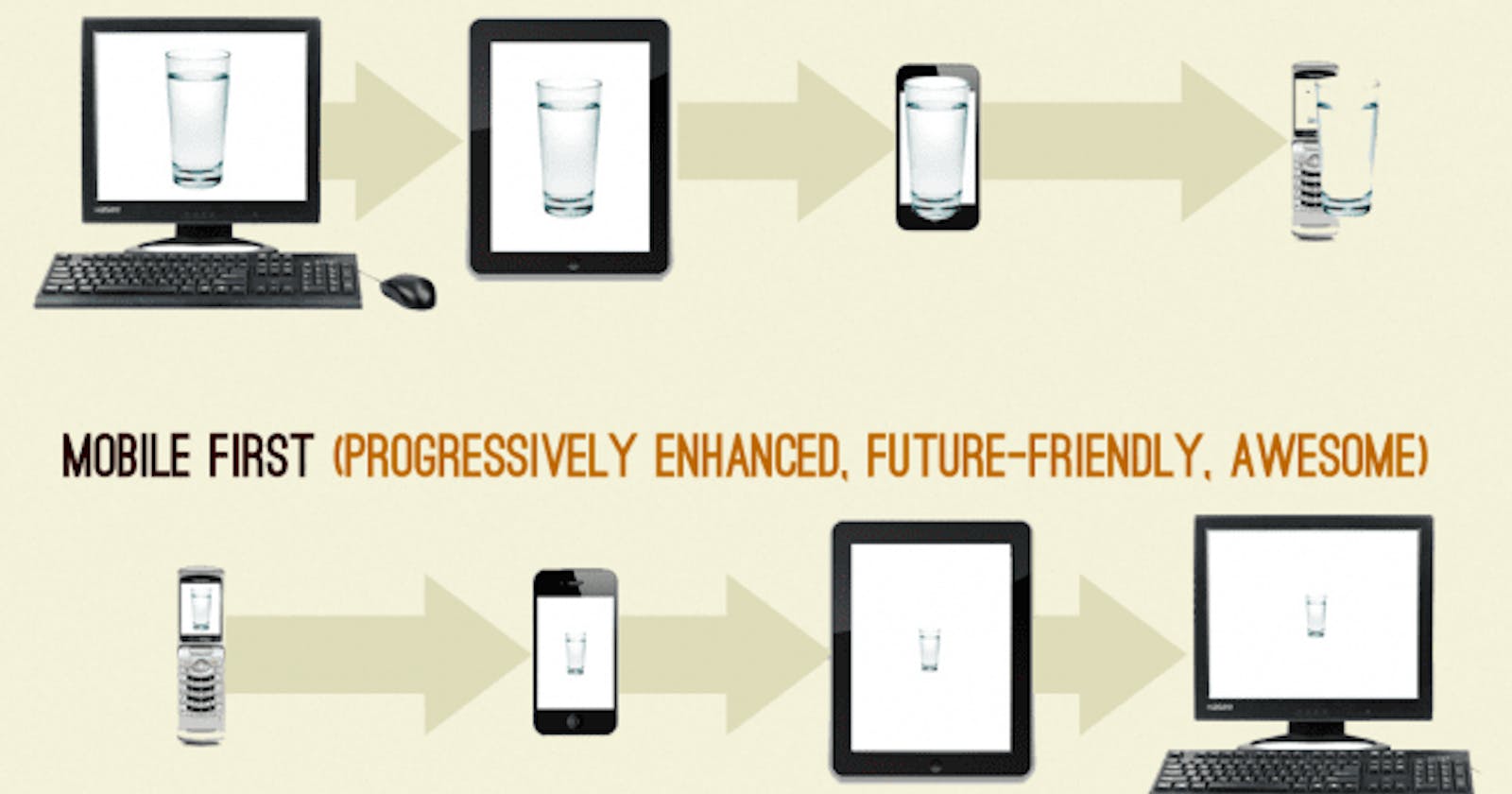
Most developers still prefer to develop desktop-first websites, and then scale down to mobile sizes. However, if you are working on a user-based product, Let's take a quick trip on why this is not a very good idea.
1. According to the google analytics benchmarking feature, 68.1% of your website visits come from mobile devices:
Research has shown that it takes the average person 10 - 20 seconds to visit a web page and decide if they will be staying or close the tab. This statistics is especially important to note if you are building a user-based product, (i.e a website where your target audience is individuals as users). Google analytics already tells you that the bulk of your visitors are coming in from their mobile and you have 20 seconds max to grab their attention and keep it. You may not like it, but you want to be user-conscious of this fact as you develop.
2. It is always easier to scale up than scale down:
A mobile screen is small (shocker). As a result, there is limited space to put all the important information, recall the 20-seconds attention span. When designing a mobile-first, you want to be sure you have the important information on the screen, then scale it up to fill the extra spaces on larger screens.
3. Mobile-first design approach emphasizes focus on the important details:
As a drawn-out explanation from points number 1 & 2, designing mobile-first ensures that you are emphasizing the must-haves of your website. Think about it, you have limited space and time to really grab the attention of your user, you want to put your best foot forward - highlighting the most important features of your website as it concerns the user. In this instance, you are really thinking through (with all of the project stakeholders of course) the most important features the website should have.
4. Avoid the media query soup:
One of the things I discussed in an article I wrote about responsive web design is avoiding the media query soup. How do you know your media queries have become a soup? simple, when you write for breakpoints for every other viewport.
.container{
width: 766px;
}

@media screen and (max-width: 1140px){
width:520px
}

@media screen and (max-width: 1024px){
width:420px
}

@media screen and (max-width: 768px){
width:360px
}

@media screen and (max-width: 500px){
width:200px
}

@media screen and (max-width: 414px){
width:150px
}
This is a media query soup and it happens more often than not when you try to scale down from desktop to smaller sized screens.
5. Chances to get ranked higher:
Google prioritizes mobile page load speed as a key metric when determining your website's search ranking, which is significant to getting that traffic Google. It's simple, you are ranked higher if your website is mobile-friendly.
Bonus point: You write less code
The web is responsive by default. A container (e.g div semantic) already takes up 100% of the space. This is fine for mobile screens. Then, when you scale up to desktop and|or tablet, you only have to write one (or two) media queries
<div class='box'>
<h1>This is a box </h1>
</div>
Mobile-first
// box already takes up 100% of the space by default
@media screen and (min-width:768px){
.box{
width:400px
}
}
Desktop-first: more code
.box{
width:400px
}
@media query and (max-width:768px){
.box{
width:100%
}
}
In conclusion, am I saying that every developer struggles to design a responsive website when they go desktop-first? Absolutely not.
Is it possible to design a responsive website when the developer goes desktop first? Of course.
However, if the bulk of your users is going to be accessing your product from their mobile, you want to put that into consideration and expend the most of your designing and thought process energy developing for mobile sizes first.
